The Task
Redefine + elevate the NWEA brand across its visual ecosystem.
The Approach
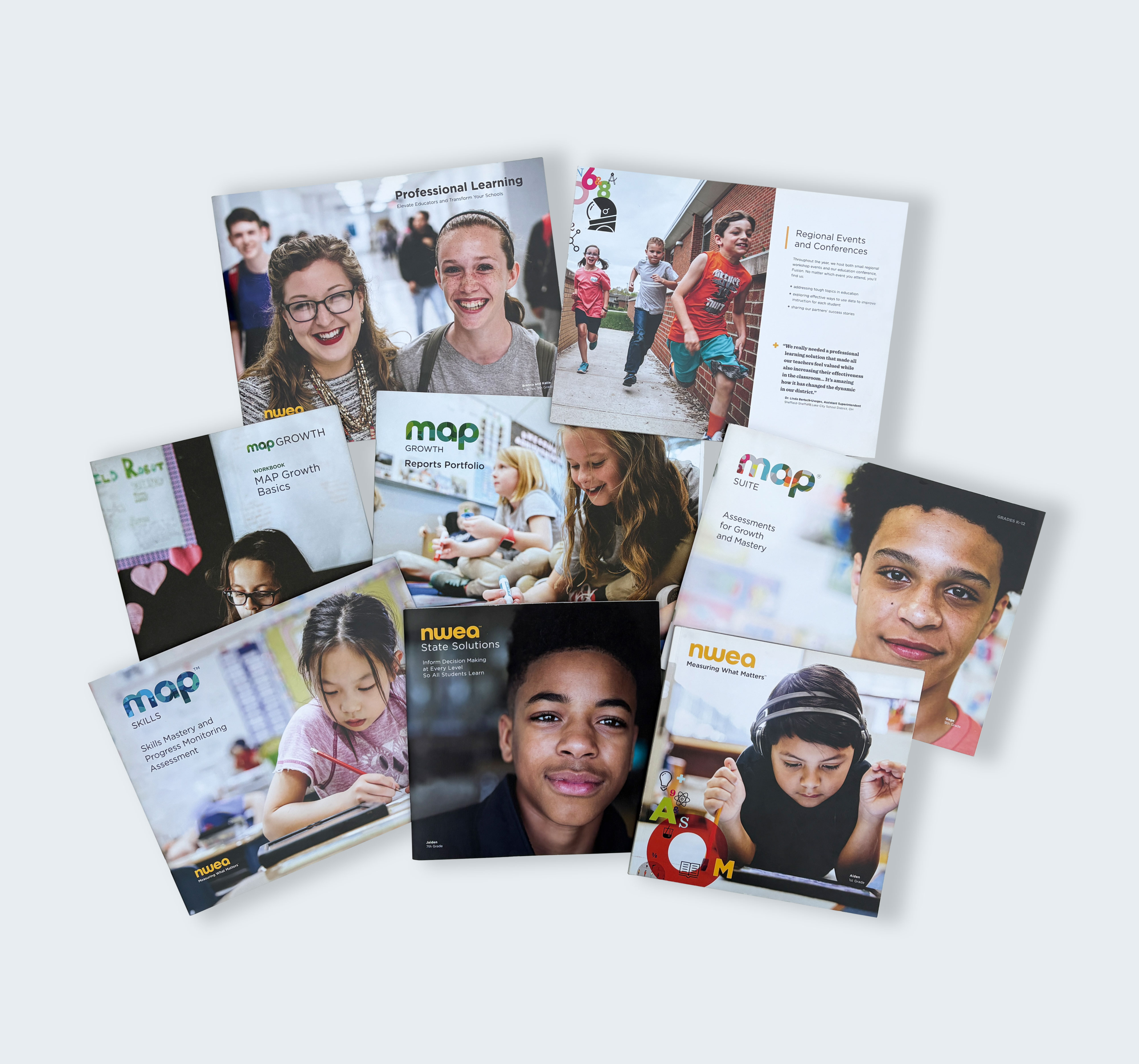
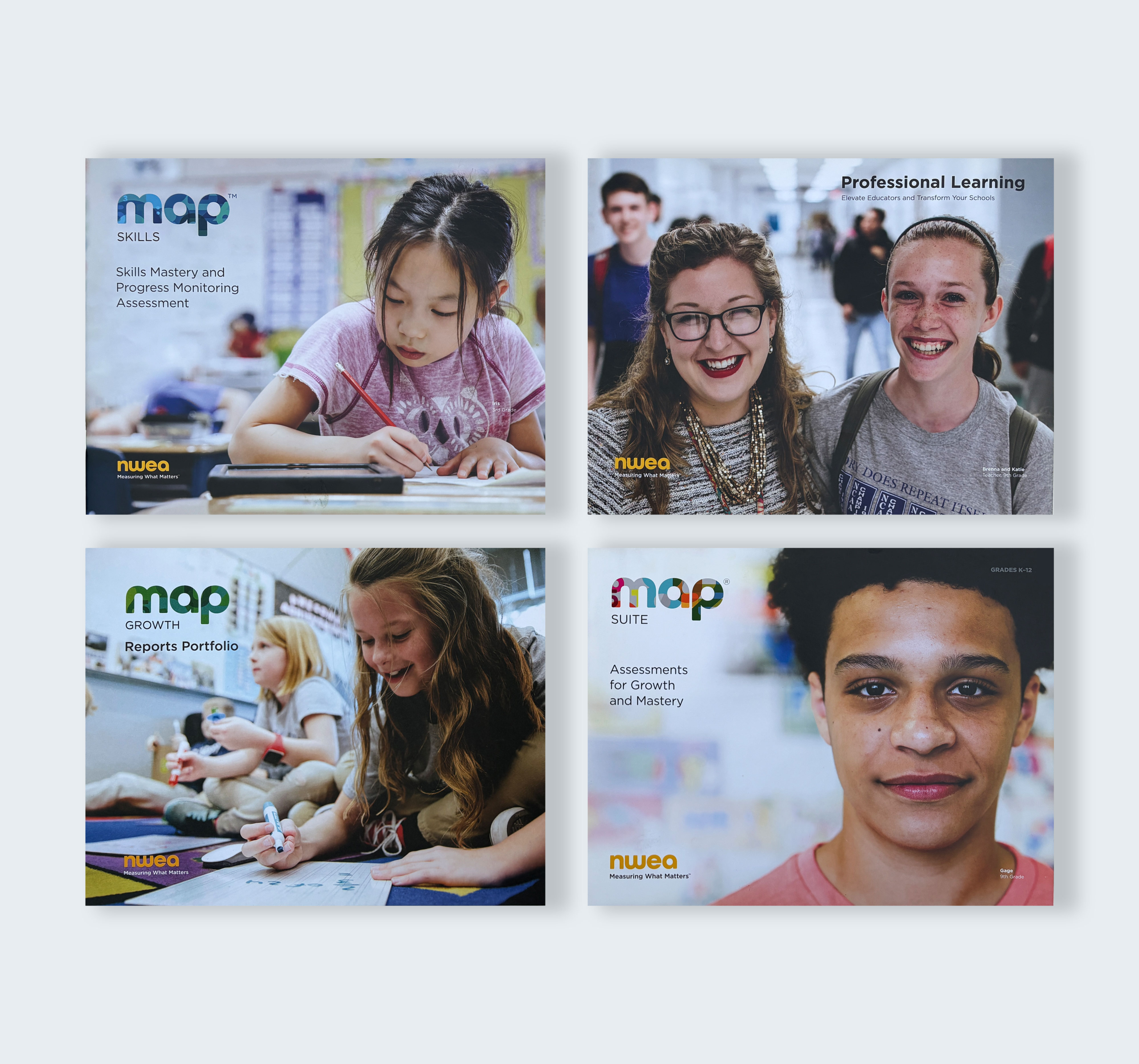
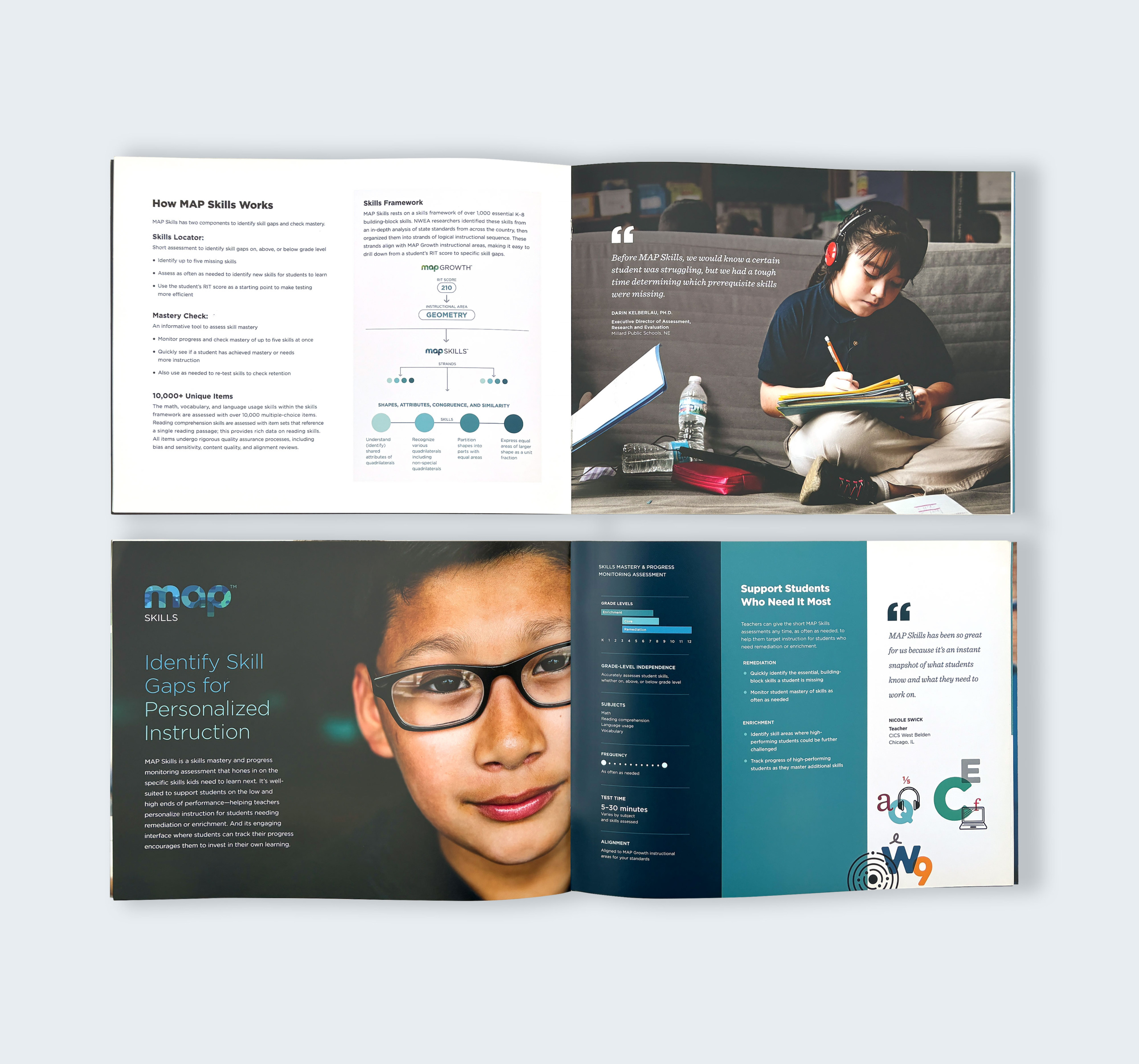
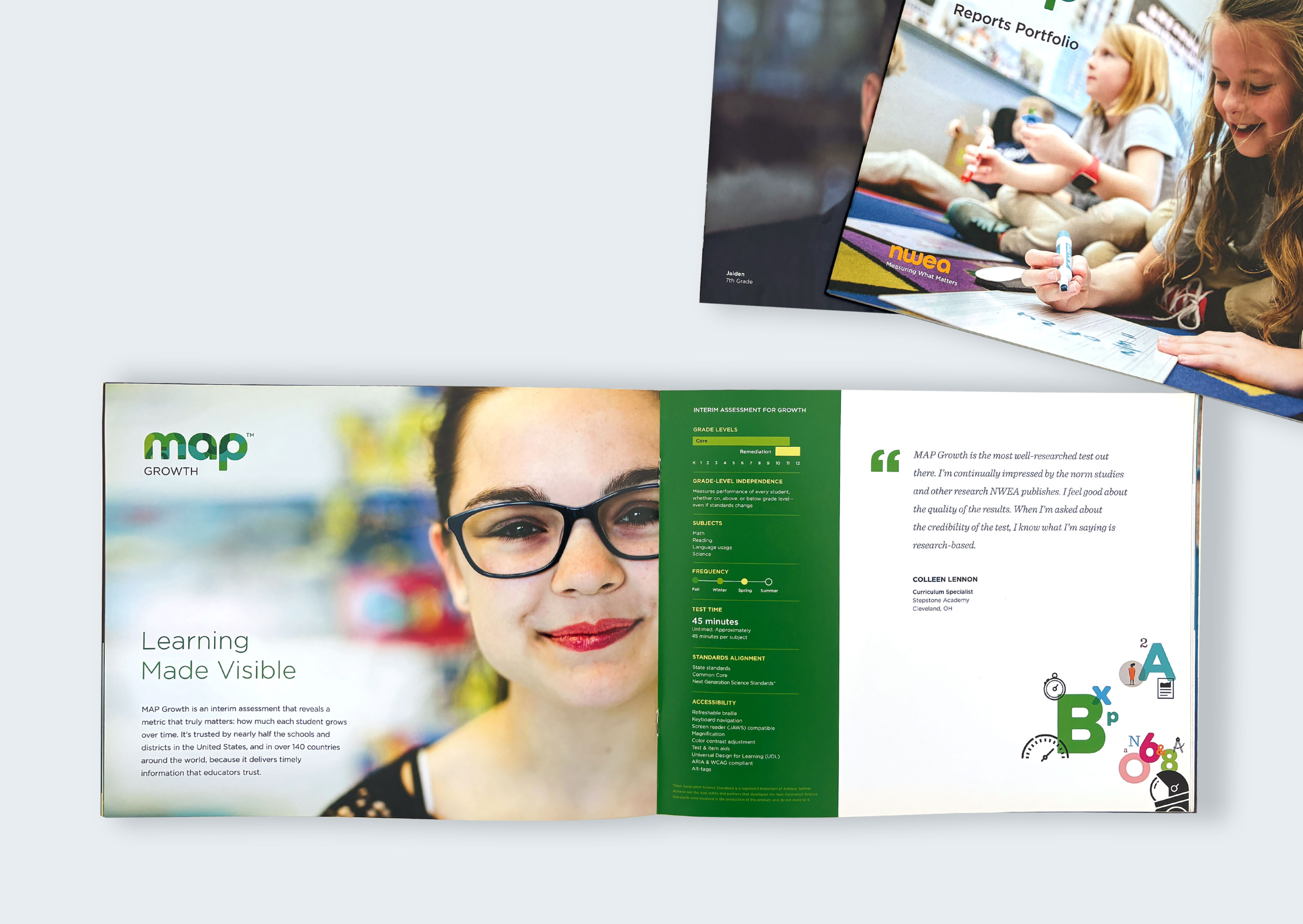
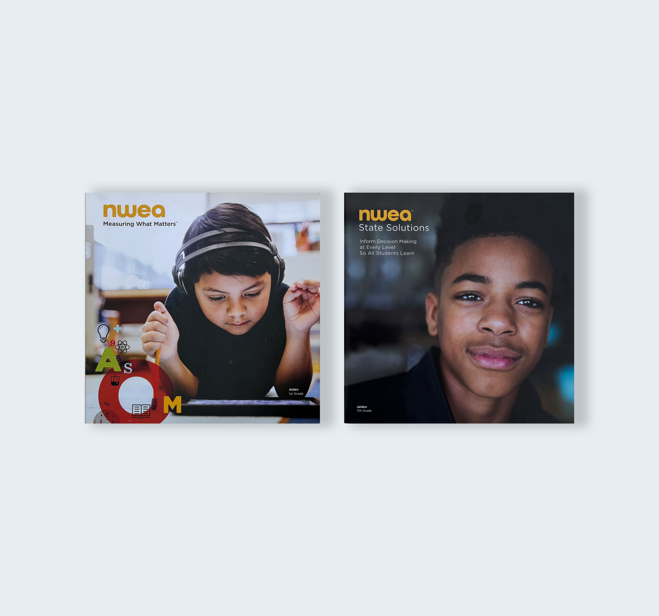
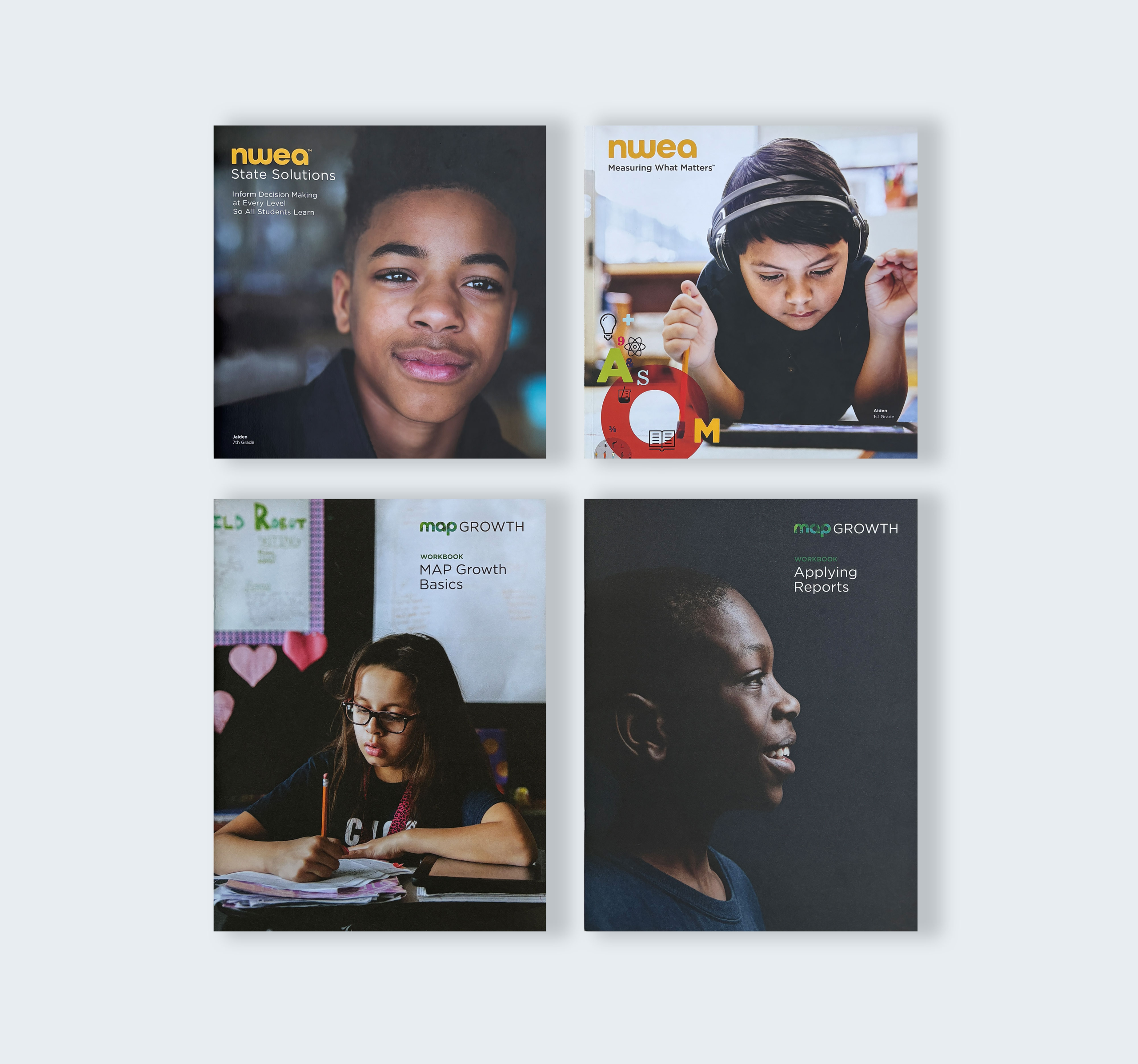
Human first. The balance of using illustrations of students + teachers and stunning real-life classroom photography created an extraordinary brand.
The Story
A NEW DIRECTION
Nestled in the heart of Chinatown, NWEA is a nonprofit education organization with a mission to make learning more meaningful and accessible. I was brought on to evolve the brand and address a growing gap between design and professional learning. There was a disconnect across research, professional learning, UX/UI, creative services, and marketing that needed to be brought into alignment. Working closely with the Head of Design, I helped navigate a new direction for the brand while serving as the creative liaison across departments.
MAPPING WHAT MATTERS
We found an intentional balance between the illustrated teachers and students and the authenticity of real-life photography. Together, they created a visual language that felt distinctly human—moving NWEA away from the conventional, often impersonal aesthetic of traditional tech brands. The goal wasn’t simply to make the brand look different. It was to make it feel different: more approachable, more inclusive, and rooted in the real people at the heart of education. This human-centered approach became an important part of how the brand connected with its audience.
OUT OF THE MARGINS
Created publication-ready data visualizations that transformed complex data into compelling stories. Developed 400+ graphics and 125 supporting assets for 30 national workshops, while restructuring and managing professional learning assets. This work helped establish a more cohesive, sophisticated visual language and set a new creative standard for the organization.
Client: NWEA
Services: Data Viz, Creative Lead, Design